| Sign-Up for Free Exclusive Services: | Portals | | | eNewsletters | | | Web Seminars | | | dataWarehouse.com | | | DM Review Magazine | |
| Information Is Your Business | Advanced Search | |||
| ||||
|
Finding the Needle in the Haystack: Using Data Visualization to Spot Patterns and Anomalies in Business Data
Some types of data analysis are challenging. In particular, applications such as fraud detection, intelligence, network management, intrusion detection, root cause analysis and portfolio management can be demanding because of the need to spot individual anomalies or small clusters of data among huge data volumes - the "needle in the haystack." These cases are particularly tough because many existing data analysis techniques are not well-suited for them. For example, OLAP and pivot tables summarize detailed granular data into roll-ups and averages. Unfortunately, a single fraudulent insurance claim may become invisible when averaged in with thousands of legitimate claims.
Techniques such as data mining and statistical analysis may perform well in the hands of advanced analytical users, but may be challenging for a broader user base. Further, the "needle" may be different every day. For example, the issue with the network today may be very different than the issue with the network yesterday. Similarly, fraudsters and hackers are constantly evolving and inventing new attacks and new techniques to hide their tracks, thus bypassing the previous statistical analysis that identified the old means of subversion. Finally, reporting and spreadsheets simply do not support the analysis of thousands of pages of data. Simply scrolling and sorting the data is a time- consuming and error-prone process that is often misleading. While these problem areas are "data rich," they are often at the same time "information poor." There is a critical need to:
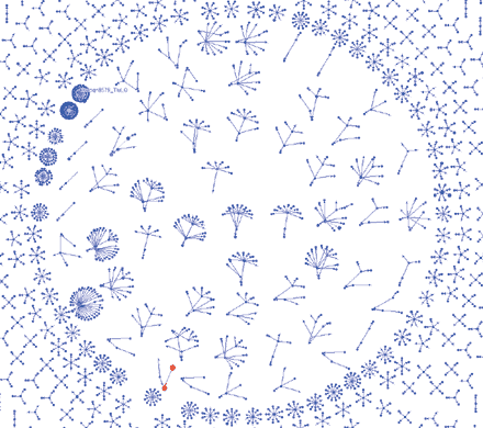
Find the NeedleBased on principles first defined and developed in university settings (e.g., those of noted Yale University professor Edward R. Tufte), data visualization is well-suited to finding the needle in the haystack because it can easily present large volumes of data, provide interactivity to explore the data, make visual patterns easy to see and make multivariate analysis simple and easy to comprehend. Data visualization has the capacity to present a very large amount of detail on a single screen. Consider an example from mobile phone fraud. There are numerous attributes collected per each telephone call, such as time of call, ID of the handset, duration of the call, call destination and area code of the call. Automated fraud techniques are certainly valuable for detecting suspicious calls. However, these suspicious calls still need to be investigated to determine if they are truly fraudulent. Each event has many variables that constantly change, and understanding the complex relationships between them is critical to appropriately applying automation. There are many ways to use visualization to make multidimensional relationships easy to see. One way is with special visualization techniques. In the Figure 1 example, thousands of telephone calls have been automatically flagged as potentially fraudulent. The visuals show a dot for each phone number. The size and color of the dot indicates the number of phone calls that caller has made/received. An arrow points from the caller to the recipient.
This representation provides the following insights:
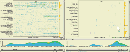
Details That MatterVisualization provides much more than making patterns easy to see. Visualization should be highly interactive, permitting the user to perform multidimensional analysis across many variables at once. In the intelligence community, one issue is simply dealing with the large volume of news articles, postings and other public information. This volume of information makes it difficult for the intelligence analyst to quickly scan through the documents to understand what is happening. The pair of images in Figure 2 shows a set of 15,000 documents (two years of e-mails). The left image shows all the documents in the scatterplot (showing time on the horizontal axis and sender on the vertical axis) and in the histogram (showing the volume of e-mail over time).
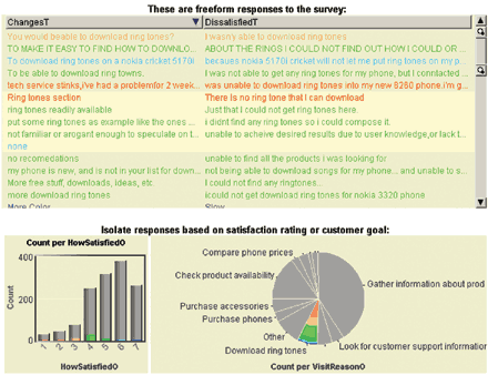
In the image on the right, the user has selected all documents that mention Enron. The visualization provides a view of e-mails specifically about Enron; notice the increasing flurry of e-mails in autumn of 2001 (as can be seen in the increasing height of the histogram). The scatterplot shows an increasing number of people sending e-mails as autumn approaches. Then, in late autumn, the internal e-mails abruptly stop. After this peak, there are still e- mails, but they from external sources such as Forbes and eWeek after Enron restated their earnings. The marker in the scatterplot shows that one of the last internal e-mails was "RE: Enron Account" -- a last attempt to review the accounting status at Enron! In this example, advanced data visualization facilitated the finding of a specific thread of e-mails in a large haystack. Then, through further point-and-click interactions with the visualization, the user can quickly reconstruct the situation leading to the problems at the account. Similarly, if this was real intelligence data, we would be able to see patterns in messages between people over time. Perspective Across Many DimensionsMultivariate data is particularly challenging because it is difficult to see relationships across many variables simultaneously. Combining visuals to see multiple attributes at once plus using interaction to slice and dice across all the dimensions simultaneously provides a very powerful means to achieve multivariate correlation. Consider the example of a Web site user survey. The Web site owner wishes to understand why people are coming to the Web site, if they were satisfied and what the visitors might change. Unfortunately, the Internet is a great place to collect data - lots of it. The Web site owner quickly has thousands of responses and needs to assess the feedback. He/she needs a way to interactively slice and dice the data and come to a conclusion about what matters. Data visualization makes the slice-and-dice process extremely intuitive - much more so than other techniques, including pull-down menus (which require pre-existing structure), pivot tables and mining algorithms. For example, suppose an analyst notices that there are a lot of unhappy visitors searching for ring tones (as indicated in the pie chart in Figure 3). The analyst can simply click the slice on the pie chart, and immediately the table shows only the responses of visitors looking for ring tones. A quick scan of the answers shows that visitors cannot determine how to download the ring tones.
By adding more visualization elements to the scene, other dimensions can also be used in the analysis, such as other answers from the survey, demographics of the respondent or derived attributes such as word frequency. By combining multiple visuals for multiple variables, the analyst has a quick and easy way to interact across many dimensions at once. The Needle Gets SmarterPerhaps no industry segment is faced with a greater challenge than the information security industry and the modern-day corporate information security officer (CISO). Large-scale enterprises in particular have a need to identify malicious behavior in real time to minimize the damage created by virus attacks, hackers and password crackers. While information security vendors offer a number of tools to block, identify, scan and manage data, only a small handful of tools exists to help CISOs correlate millions of information security log files a day into a cohesive, understandable, auditable, real-time monitoring and management capability. With today's information security haystack of log files getting larger and the needle of malicious activity getting smarter, the need to enable human beings to see and understand these threats has never been greater. One way to do this is to combine real-time and near real-time data analysis with advanced visualization to provide a progressive, in-depth view of an organization's security infrastructure over long intervals. Key value comes from:
Key focus areas include unusual levels of communication between workstations and servers, spikes in errors on a Web server and abnormally low levels of activity on security devices. These types of anomalies alert companies to irregular behavior so they may proactively identify potential threats and take action immediately. These types of events are constantly changing and are difficult to spot. They can easily be lost in the haystack of data and algorithms. By leveraging data collection, aggregation and correlation capabilities, advanced data visualization provides the ability to target precise investigations and pinpoint specific trends and linkages over time through many visual display options including: pie charts, line charts, bar graphs, time tables, scatter plots and histograms. The value added can be substantial. With data visualization, analysts have been able to:
Additional value over the long term includes comprehensive graphs and charts for explaining security situations to employees and management, and building budget cases for security resources. It's starting to work. Innovation in the security industry through the emergence of advanced data visualization software that enables analysts and staff to find the needle in the haystack has resulted in fewer dollars being lost to malicious activity. According to a joint survey by the Computer Security Institute and the FBI, U.S. businesses and other entities lost $201.8 million to digital attacks this past year -- a significant number, but down from the year before due to increased focus on the problem with better business intelligence tools. The most common attacks involve viruses, laptop misuse and forbidden access by insiders - all activities that are being identified and stopped with appropriate discovery and analysis. ............................................................................... For more information on related topics visit the following related portals... Data Visualization. Richard Brath is senior director of business development with Oculus Info where he works with Fortune 500 and software companies to design and implement information visualization solutions to solve unique, high-value business problems in areas such as performance management dashboards, risk management, network security, customer segmentation and real-time monitoring. Brath has been actively involved in the design and development of 3-D visualization and design software over the past 16 years, a frequent speaker on the subject and author of numerous articles. You can reach him at Richard.brath@oculusinfo.com. Andrea Brody is the president of EA Brody Consultants, a consulting firm dedicated to helping high-tech companies achieve their business objectives by providing strategic planning, marketing, product management and business development consulting services. She has held various executive management positions for both start-up and established high-tech software companies. She brings more than 15 years of experience in the areas of strategic and product planning, corporate development, marketing and product management. Brody may be reached at andrea.brody@comcast.net.
|
| ||||||||||||||||||||||||||||||||||||||||||||||||||||||||||||||||||||||||||||||||||||||||||||||||||||||||||||||||||||||||||||||||||||||||||||||||||||||||||||||||||||||||||||||||||||||||||||||||||
| |||||||
| Site Map | Terms of Use | Privacy Policy | |||||
| |||||||